
Jakob Nielsen’s 10 usability heuristics for user-interface design have been widely used as broad rules of thumb for guiding design decisions since their original introduction in 1994. These 10 heuristics provide sound guidance for practitioners working on complex, domain-specific applications, in the same way as they apply to most other forms of interactions, from video games to VR apps. (The reason being that the usability heuristics are very general, as implied by the very word “heuristic.”)
We’ve previously defined a complex application as any application supporting the broad, unstructured goals or nonlinear workflows of highly trained users in specialized domains. Enterprise applications, applications supporting complex data analysis and modeling, and systems supporting high-impact or high-value decision making fall into this category. In this article, we provide examples of how each heuristic applies to complex applications like these.
- #1: Visibility of System Status
- #2: Match Between System and the Real World
- #3: User Control and Freedom
- #4: Consistency and Standards
- #5: Error Prevention
- #6: Recognition Rather than Recall
- #7: Flexibility and Efficiency of Use
- #8: Aesthetic and Minimalist design
- #9: Help Users Recognize, Diagnose, and Recover from Errors
- #10: Help and Documentation
- Conclusion
#1: Visibility of System Status
Appropriate feedback for a user action is perhaps the most basic guideline of user-interface design. Without appropriate and timely feedback, users may not understand that their action has been interpreted correctly and that the system is attempting to carry out their request. They may end up confused and mistrustful.
One of the most common examples of feedback is a progress indicator. Progress indicators inform users of the current working state of the system and reduce uncertainty as the user waits for the process to complete. Because longs waits are a common reality within complex applications, users benefit from detailed information about what is happening, such as time elapsed (or steps completed) and time or steps remaining.
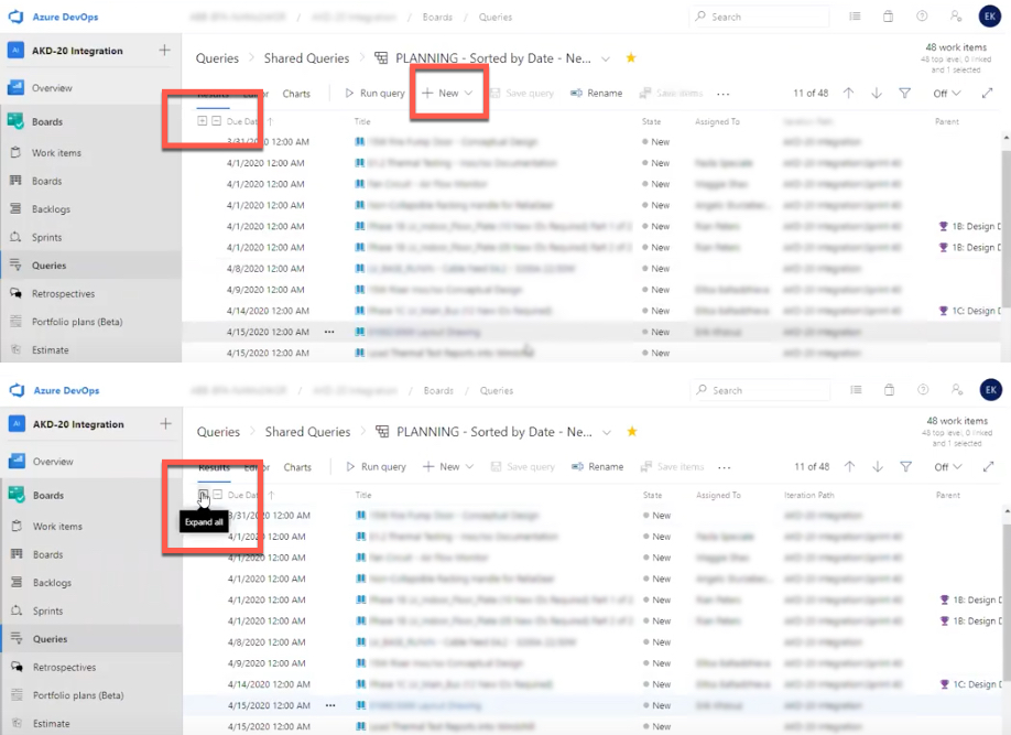
ArcMap, a geographic information system (GIS), supports this heuristic by providing details about steps completed and steps remaining when users perform complex data queries and connections.
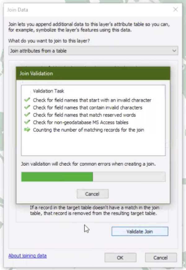
A relative indication of how much longer the system expects the process to take allows users to decide whether to wait for the process to complete or begin another task during this time. When waits exceed 10 seconds — a common scenario within complex applications — generic loop animations fail to support users in making this decision.

#2: Match Between System and the Real World
The design should speak the users' language. Use words, phrases, and concepts familiar to the user, rather than internal jargon. Follow real-world conventions, making information appear in a natural and logical order. (Read our full article on match between system and real world.)
Part of supporting this heuristic is leveraging users’ familiarity with the real world to help them understand controls and concepts within the application. Designers can take advantage of already established cultural metaphors and norms to create natural mappings that follow users’ expectations and make it easy for them to complete tasks without having to recall any additional information. When these cultural metaphors are broken, confusion ensues.
For example, in American culture, the concept of a “coffee break,” where a worker takes a few minutes respite from their task to enjoy a cup of coffee, is well established. One software for call-center management and monitoring violates this established convention by putting an image of a steaming coffee cup next to the names of those call-center representatives who are available to take a call.
The call-center manager in our study complained, “For whatever reason, [this software] puts somebody that’s available with a little coffee cup. I don’t know why. You would think that would mean [they were] on a break.” Even for frequent users (this particular call-center manager had been using this application every day for years), these types of mismatches between the system and real-world concepts cause compiling inefficiencies over time, as users must stop to recall the system-specific meaning over and over again.
#3: User Control and Freedom
Users often perform actions by mistake. They need a clearly marked "emergency exit" to leave the unwanted action without having to go through an extended process. (Read our full article on user control and freedom.)
All users certainly benefit from UI controls that allow people to go back to the previous state of the system (e.g., Back buttons to return to previous screens, Undo options to regress to former states, or Cancel links to quit multistep processes) regardless of the task at hand. Users of complex work, however, are often investing high levels of cognition and time into their workflows. They need the option to quickly correct errors or backtrack on choices made so that their investment isn’t lost due to a slip (right intent, wrong action) or mistake (wrong intent) as they learn the system.
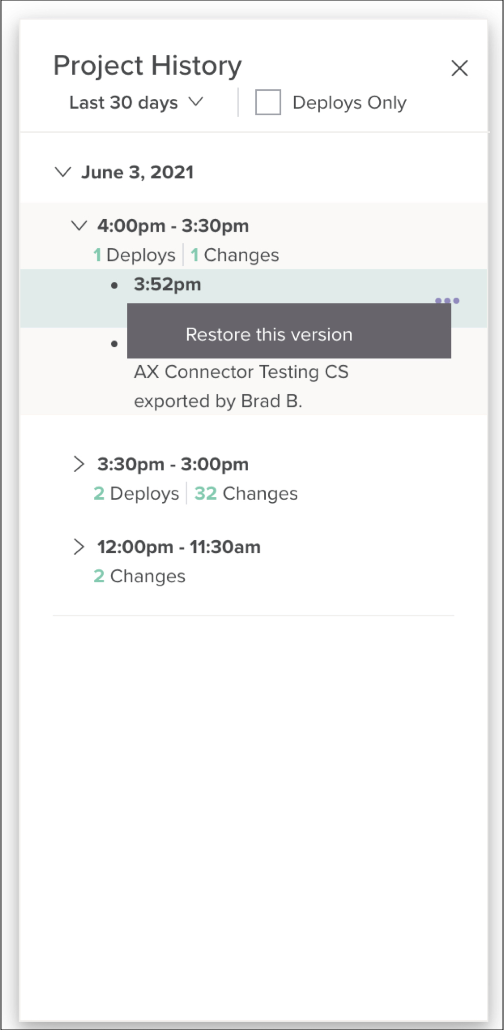
Jitterbit Cloud Studio, an application for connecting cloud and on-premise software and deploying APIs, supports this heuristic by providing users with the ability to restore their work to an earlier version, which the system automatically saves. Users can access a timeline of project history, view changes and deployments within their project, and reinstate a previous version. Especially for new or infrequent users, features like this are invaluable for supporting learning by doing (i.e., allowing users to figure things out without suffering dire consequences as they learn).
#4: Consistency and Standards
Users should not have to wonder whether different words, situations, or actions mean the same thing. Follow platform and industry conventions. (Read our full article on consistency and standards.)
Complex applications usually support highly unique, domain-specific workflows. Regardless of the high level of specialization, there’s plenty of opportunity for creating consistency, both external and internal. Consistency helps users know what to expect and increases learnability.
Internal consistency relates to consistency within a product or a family of products. This type of consistency is maintained when interactive components use the same visual presentation and language throughout.
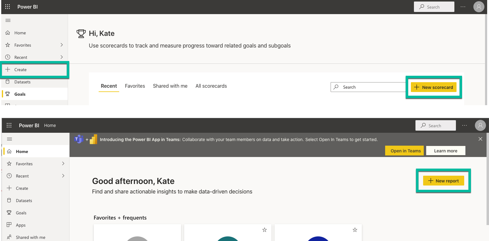
For example, Microsoft Power BI supports internal consistency by reserving the plus sign to indicate the action of adding something new throughout various workspaces within the application. Moreover, the primary call to action to create a new item is in the same location (the upper-right corner) in each workspace, and the visual design of these actions is consistent.
External consistency refers to established conventions in an industry or on the web at large. Jakob’s Law still applies: Even complex-app users who use the same application day in and day out for their work spend much of their time on other sites and applications, and that time elsewhere shapes their expectations for every interaction, regardless of platform.
Like we saw in the Microsoft Power BI example, it’s relatively well accepted that the plus sign indicates adding or creating an element, item, or object. In one DevOps-focused project-management application, however, the plus sign was used to indicate the ability to open a pane with additional details about individual tasks.
Not only does this approach break external consistency, but, in this case, also internal consistency: the plus sign is used elsewhere within the same application to indicate adding something new. One daily user of this application asked: “Can I add a task here?” as he noticed the plus sign in the table. “Oh, this just expands,” he added, as the hover description was revealed. Here again, we see evidence that frequent users — not just new users learning the system — are confused by lack of consistency.
#5: Error Prevention
Good error messages are important, but the best designs carefully prevent problems from occurring in the first place. Either eliminate error-prone conditions or check for them and present users with a confirmation option before they commit to the action. (Read our full articles on error prevention for slips and mistakes.)
It’s a well-researched phenomenon that users tend to start using things rather than taking time to understand them first. This concept is known as the “paradox of the active user.” It’s a paradox because we know that if users did take the time to learn the system or read documentation, it would save them time in the long run, but, alas, they are focused on just getting started as soon as possible. We can support this common user behavior by designing workflows for preventing problems as users explore and learn the system or try new things.
For example, when users build dashboard components in Salesforce, they can see a real-time preview of the widget as they add and tweak parameters. Showing changes to the widget as these incremental decisions are made helps users understand the effect of their actions and quickly correct any unexpected results.
#6: Recognition Rather than Recall
Minimize the user's memory load by making elements, actions, and options visible. The user should not have to remember information from one part of the interface to another. Information required to use the design (e.g., field labels or menu items) should be visible or easily retrievable when needed. (Read our full article on recognition vs. recall.)
Recognition refers to our ability to “recognize” an event or piece of information as being familiar, while recall designates the retrieval of related details from memory. Of course, recognition decreases cognitive burden; it’s much easier for users to recognize a visible, labeled icon or action than it is to recall a keyboard shortcut or gestural command (even though some expert users will prefer to use those accelerators).
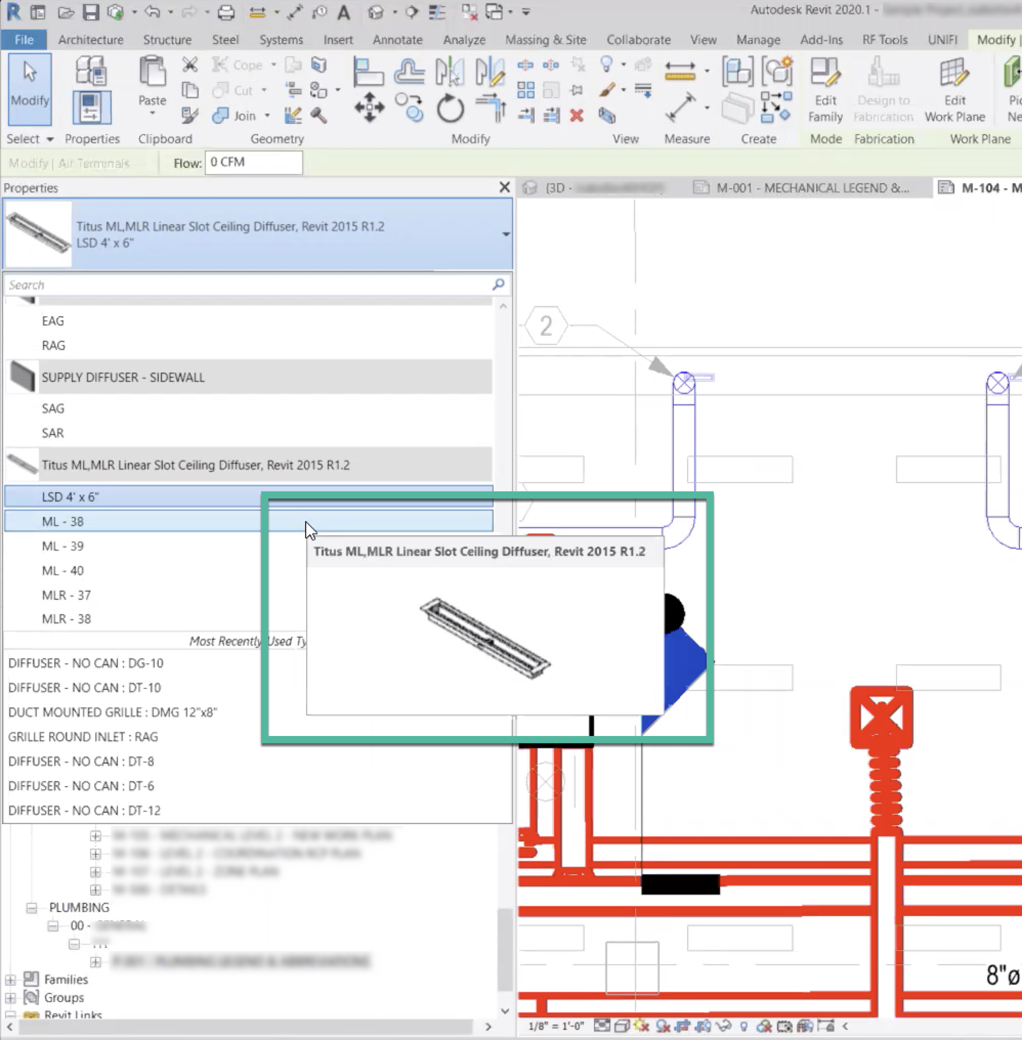
There is often so much data, options, and information competing for space and attention within complex apps that it’s useful to provide recognition cues within the interface. Revit, a building-modeling software, supports recognition over recall by providing 3D visual reminders of what various building parts look like as users hover over part numbers in the left-side panel. Instead of having to recall what part number “ML-38” is, in this example, a domain-specialist user can easily recognize the part from its image (and also refer to the detailed name displayed in the same window).
#7: Flexibility and Efficiency of Use
Shortcuts — hidden from novice users — may speed up the interaction for the expert users such that the design can cater to both inexperienced and experienced users. Allow users to tailor frequent actions. (Read our full article on flexibility and efficiency of use.)
Efficiency is more valuable than gold for users of complex applications. Yet, all users, regardless of their level of expertise and training with a system, eventually reach an efficiency plateau where continued usage does not increase efficiency any more. In other words, once users have fully learned the interface, they “max out” their ability to continue gaining efficiencies through task repetition.
Accelerators — UI features that speed up an interaction or process — help expert users push past this plateau by providing faster methods (i.e., shortcuts) to accomplish the same tasks. Common accelerators are keyboard shortcuts, macros, touch gestures and mouse-driven gestural commands. Experts can make use of these shortcuts to become more efficient; at the same time, novice users can still use primary methods of completing a task, such as step-by-step wizards or clearly labeled menu items.
Solidworks, a program for modeling mechatronics systems, supports flexibility and efficiency of use with gestural commands. By moving the mouse at a certain velocity in a certain direction, the user can reveal shortcuts to common commands. Furthermore, users can customize these commands to define their own shortcuts in order to suit their common workflows and preferences.
#8: Aesthetic and Minimalist design
Interfaces should not contain information which is irrelevant or rarely needed. Every extra unit of information in an interface competes with the relevant units of information and diminishes their relative visibility. (Watch our video on aesthetic and minimalist design.)
An aesthetic and minimalist design is about keeping the content and visual design focused on what’s essential for users. Every item in an interface — every label, icon, button, and data point — is competing for attention and straining users’ cognition. Especially in a complex interface, where lots of competing information and controls are inherent, noncritical elements make visual-search tasks more difficult.
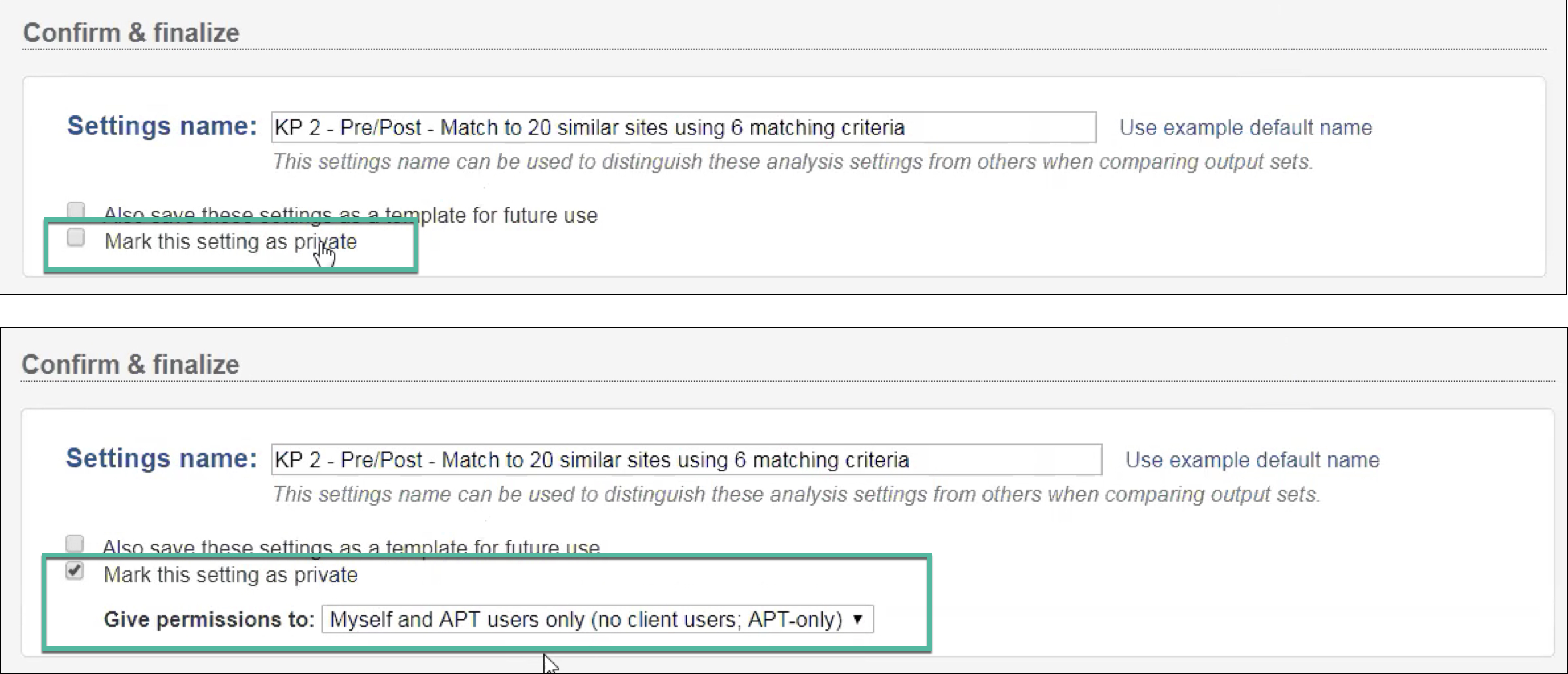
If there are elements within the interface that are rarely used or used only by a small number of users, staged disclosure can be used to defer those elements to a secondary level. For example, Mastercard Test and Learn makes use of staged disclosure to reveal advanced settings only after a relevant field is checked in a dynamic form. In this case, the field Give permissions to displays only after Mark this setting as private is checked.
This heuristic can also be supported by completely stripping nonessential elements from the interface. Many complex applications are guilty of gratuitous graphics — visual elements that serve no real purpose and decrease the visual salience of critical information. For example, the project-management software below uses an icon to denote an item type (here, tasks) within a list containing only items of that type. These icons do not help visual search; they only add clutter to the interface and waste precious space.
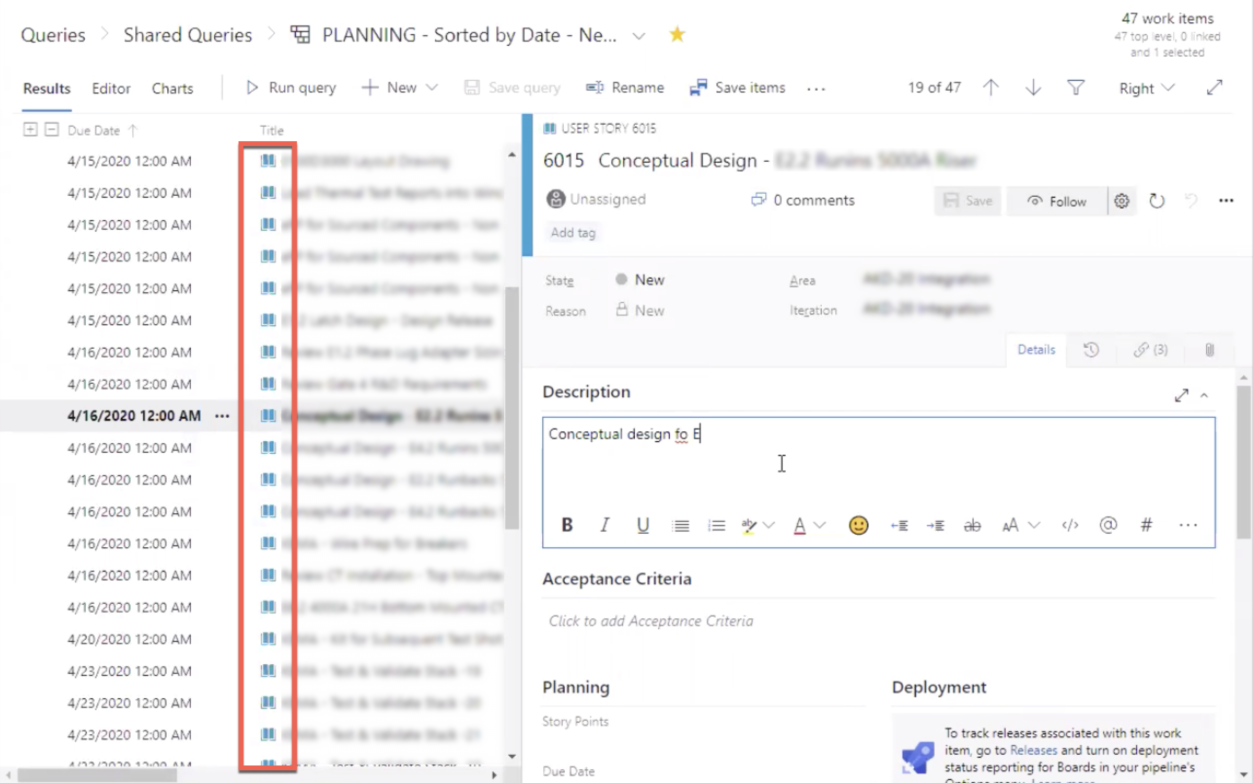
#9: Help Users Recognize, Diagnose, and Recover from Errors
Error messages should be expressed in plain language (no error codes), precisely indicate the problem, and constructively suggest a solution. (Read our full article on error message guidelines.)
Error messages should be discoverable, descriptive, and help the user understand how to fix the error. This heuristic is commonly unsupported within complex applications. Assumedly, users are expected to be trained on the system or otherwise gain expertise through long-term exposure and understand system-model nuances and codes. This is too much to ask.
A common way this heuristic goes unsupported is with error messages do not offer direct resolution guidance. Failing to provide constructive advice about how to fix the error is a double miss. Not only are users left without an avenue to recover, but a valuable opportunity for increasing learnability is wasted — as users are particularly motivated and more likely to read instructions when they need to recover from an error. Concise, yet descriptive error messages teach users about the system.
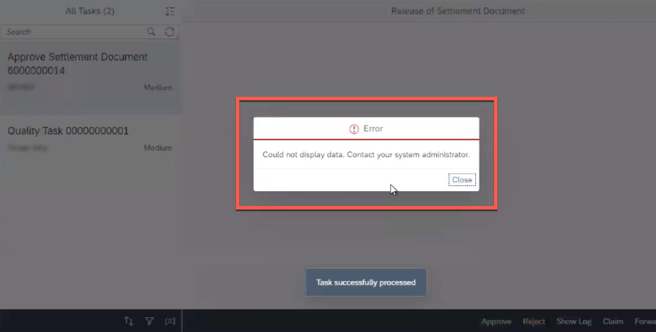
In one enterprise resource-planning (ERP) platform, a user encountered the error message shown below: Could not display data. Contact your system administrator. This is effectively a dead end for this workflow. Contact your system administrator is not sufficient resolution guidance, and Could not display data does not communicate what went wrong.
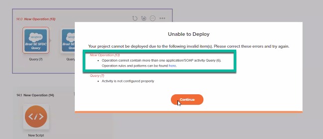
For times when resolution guidance cannot be succinctly included in an error message (a reasonable scenario within complex applications), link directly to more extensive documentation or help content within the error message (but don’t overrely on this approach). For example, when a project is unable to deploy due to invalid operations, Jitterbit Cloud Studio provides links to extensive documentation on operation rules and patterns.
#10: Help and Documentation
It’s best if the system doesn’t need any additional explanation. However, it may be necessary to provide documentation to help users understand how to complete their tasks. (Read our full article on help and documentation.)
Many complex applications require user training, or at least are accompanied by robust documentation and help sites. Training and documentation are highly useful resources for users performing infrequent or specialized tasks; however, we know that users rarely spend any time reading robust documentation before attempting to complete tasks, and even the best training is difficult to recall in the moment. For these reasons, it can be useful to provide abbreviated, in-context help and guidance within the application.
For example, Revit, a software for building modeling, provides in-line help for toolbar commands. As the user hovers over items in the toolbar, a brief description of the command, a keyboard shortcut, and even a short video clip demonstrating the command in action are revealed in a large tooltip.
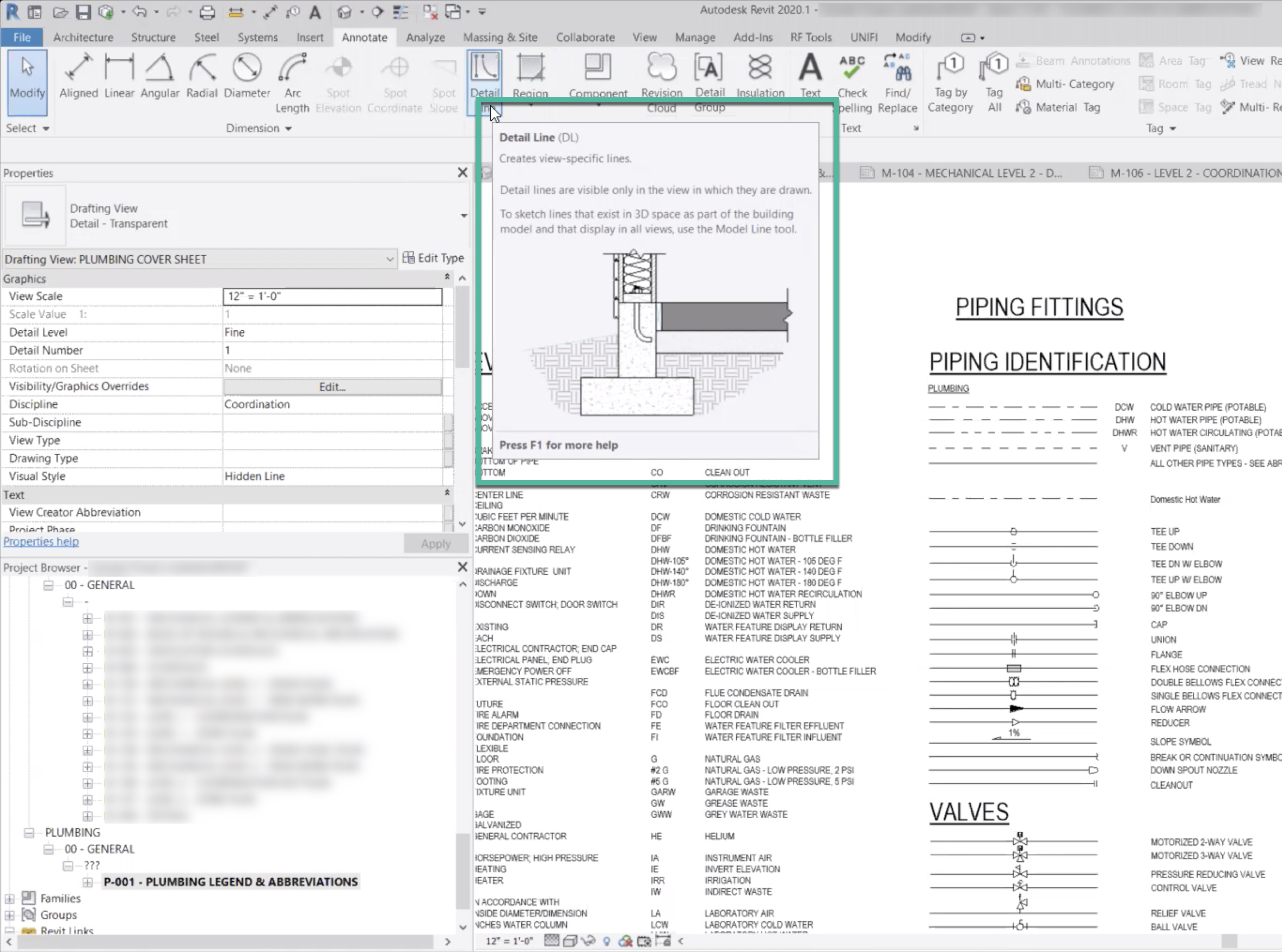
This method of providing brief in-line help content is often a better way to expose the user to help content than lengthy, forced tutorials during initial usage because it’s within the application and more likely to be utilized and referenced in context of use.
Conclusion
It’s a fact that designers and researchers of complex applications face unique and/or exacerbated interface-design challenges; yet, Jakob Nielsen’s 10 heuristics are tried and true. Attention to and investment in supporting these heuristics can greatly increase usability, learnability, and user efficiency for domain-specific, complex applications just as much as for generalist applications for everyday domains.
Of course, in addition to these general principles, there are many more specific guidelines for designing complex applications.