
Color is one of the most important and influential tools a designer has. In designs, it can set the brand tone and influence its image, draw users’ attention, affect their emotions, and increase usability. However, finding the right combination of colors can be tricky and requires some basic knowledge and practice.
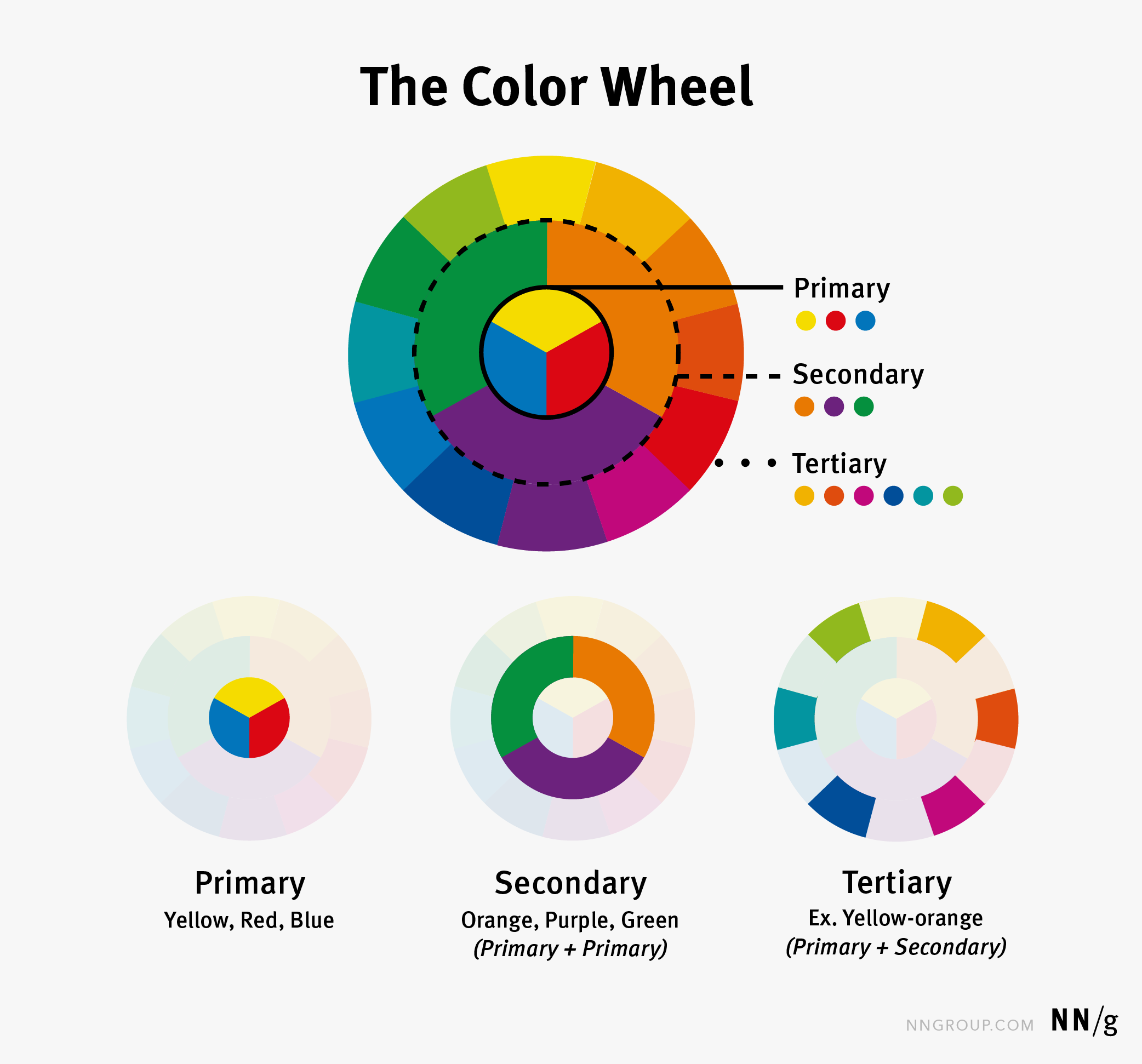
The Color Wheel Explained
Colors are how our eyes perceive different lightwave lengths. In 1666, Sir Isaac Newton identified three color groups:
- Primary: yellow, red, blue
- Secondary: orange, purple, green (mixes of primary colors)
- Tertiary: yellow-orange, red-orange, red-violet, etc (mixes of primary and secondary)
Newton placed these colors on a color wheel to illustrate the relationships between them.
Color Theory
In visual arts, there are various attempts to explain what colors go together — these are known as color theory. While the details of color theory are beyond the scope of this article, a basic concept is that of color harmony: a set of colors that work well together.
You could think of color harmonies as the building blocks or the underlying template of a color palette. Some common color harmonies are:
- Analogous: colors that are next to each other on the color wheel (This color harmony creates low color contrast.)
- Complementary: colors that are opposite on the color wheel, which produce high color contrast
- Split-complementary: a color combined with others from either side of its complementary color. This harmony slightly softens the contrast from basic complementary colors.
- Triadic: three equidistant colors (120 degrees apart) on the color wheel
- Monochromatic: tones and shades of a single hue

There are more harmony types that use four colors. However, the more colors you introduce, the harder it can be to balance and enforce visual hierarchy. If you have lots of color experience, you can experiment with more-complex harmonies, but start with two or three colors.
Color Meanings
While there is a plethora of popular articles on the internet that will elaborate on the meaning of various colors, there is little real research that proves a universal effect of a particular color on emotions. In general, while with the advent of globalization certain colors may have achieved standard meanings (e.g., red for stop, green for go), it is safest to assume that color interpretation will vary from culture to culture. For example, what’s the color of money, red (China) or green (USA)? Also, keep in mind that some individuals may not be able to distinguish between certain colors due to color blindness.
If you are aiming for an interpretative meaning of colors in your design, then (a) be aware that it will likely not work worldwide and (b) run additional user testing to make sure that your color interpretation matches that of your users.
Applying Color to Designs
Color palettes are a range or set of colors that have been selected for a particular project, brand, or set of designs. Each individual color is purposely added and the overall set of colors provide a glimpse into the visual aesthetic of the product or interface.
Creating a Color Palette
Creating a color palette can be challenging. The following guidelines can help you to create a color palette:
- Choose a color harmony (from above) and iterate on individual colors. A monochromatic scheme is typically the easiest to create and apply, so if you have zero color experience, start with this harmony. Once you settle on a harmony, switch different colors in and out to see how they work and look together until you get a winning combination that you like and that works well for your design. Don’t feel like you have to get it right the first time. If you feel stuck or just don’t know where to start, draw inspiration from existing palettes (e.g., use Adobe Color or look at websites that you like). Try to understand why you like a particular color set. Is it the color saturation? Are the colors soft? Harsh? Warm or cool? Understanding why you like a particular color palette can help you move forward in creating your own.
- Limit your palette to three colors. A small number of colors reinforces visual hierarchy and contrast because there is less for users to consider and get distracted by. For example, have you ever had a hard time finding a specific cereal in the cereal aisle? That’s because there are so many colors! All the colors are competing for your attention. The same is true in your designs. Less is more.
- Follow your brand’s color guidelines. When creating a color palette, always follow established color guidelines. Not only will your job be easier because you’ll consider fewer color alternatives, but it will also create a strong, consistent brand experience. If you don’t have a brand color guidelines, look at colors used in existing designs and products and try incorporating them in your palette.

Using the Color Palette
Once you have your color palette, it is time to apply it to your designs and see how it holds up. Here are a few guidelines:
- Use the 60-30-10 rule. This rule simply means that colors should be used in 60%, 30%, and 10% of your design area. Use 60% for the dominant color, 30% for the secondary color, and 10% towards an accent color. These proportions help create balance and prevent you from making a colorful and chaotic mess. Typically, the dominant and secondary colors should be relatively neutral colors. Reserve the accent color for what you want to stand out the most on your page — for example, the primary call to action.
- Apply then iterate. Once you’ve used the 60-30-10 rule, tweak your colors so that you improve aesthetics and also salience of what is important in your design. Look at how visual-design principles are at work in your design. Do your color choices help create the right visual hierarchy — in other words, is the eye drawn to those elements in your design that you want to emphasize? Do your color choices create balance and contrast in your design? Make sure the color is working for you in the design.
- Use colors consistently in your interface. If you use bright blue for your calls to action on one screen, that same color should be used for calls to action everywhere (unless you have a really good reason for deviating from that color use). If you use red as a warning color on one screen, it should be not used to mean something different elsewhere. Consistency is key in helping your users understand the use of color.

Testing the Color Palette
- Test your design. Once you applied your color palette to your design, do some usability testing. Colors can change the usability of buttons, links, or any other type of component. For example, gray buttons can sometimes appear disabled even if they are not intended to be. Also, look for legibility and accessibility issues — related both to contrast and color blindness. We like using accessible-colors.com to test the accessibility of different text—background combinations. Moreover, if your usability testing suggests that some of your colors don’t hold up, go back and iterate on your palette again.

Conclusion
The choice of a color palette and its application to a design are not mere happy accidents. It takes iteration and careful application to really benefit and take full advantage of color in a UI. Appropriate color use can enhance brand perception, draw attention and encourage interactions, impact users emotions, and increase usability.


